Gaming
Hype doesn’t make games stand out. They stand out by being different.
I’ve spent much of my career helping launch games into crowded markets, looking for the one visual idea that makes someone stop, look again, and remember it. Whether it’s an original IP or a beloved franchise, I love building worlds players want to step into long before they ever pick up the controller.
Killer Klowns From Outer Space: The Game
THE CHALLENGE
How do you introduce a new multiplayer horror game while staying true to a cult classic that’s been loved for decades?
Fans didn’t just want another licensed game, they wanted their Killer Klowns.
THE IDEA
Instead of reinventing the franchise, we leaned into everything fans already loved: the oversized personalities, surreal carnival atmosphere, and horror nostalgia that gave generations of fans the nightmares they craved.
Every piece of artwork was designed to feel instantly recognizable while giving the game its own identity.
BEHIND THE SCENES
THE PROCESS
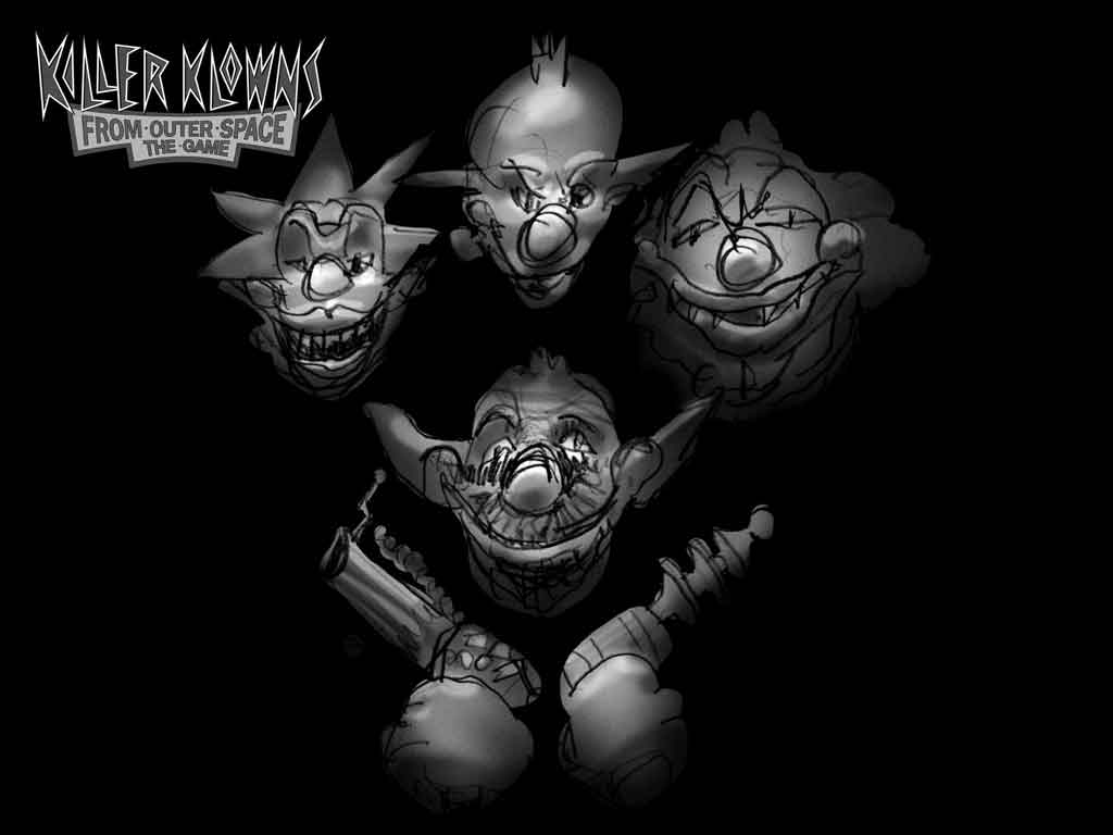
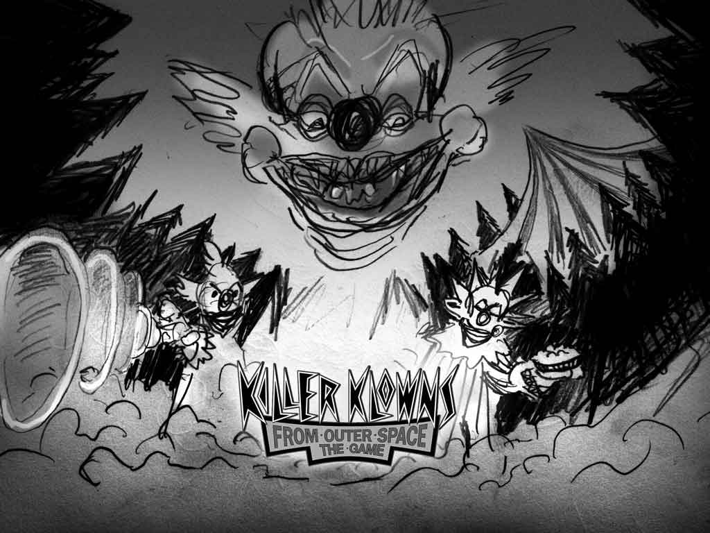
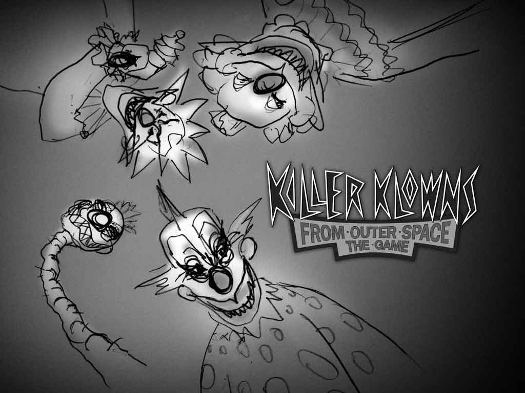
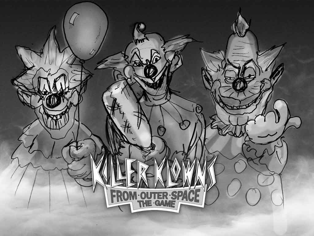
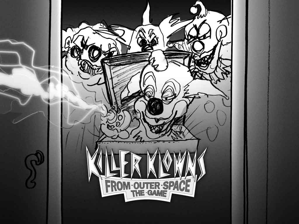
- Every key art campaign starts with exploration.
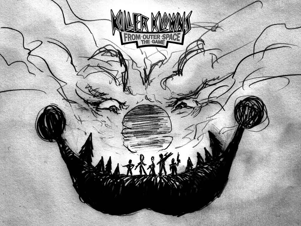
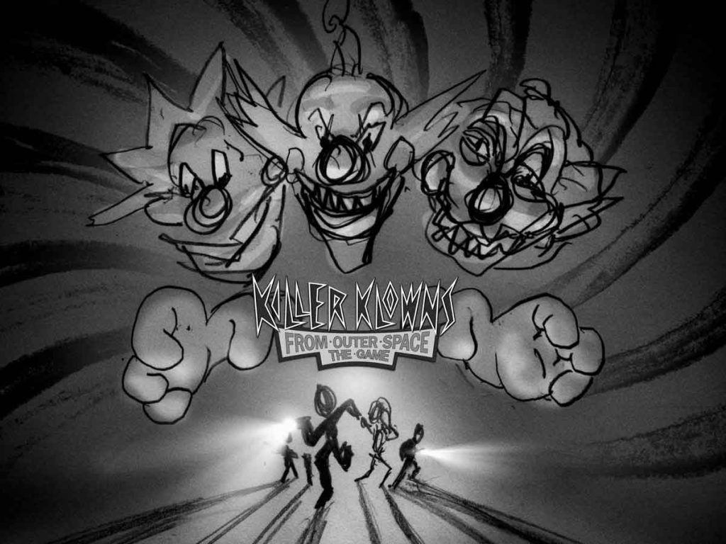
Dozens of thumbnail sketches are created to quickly test composition, hierarchy, emotion, and storytelling before committing to a single direction. At this stage, quantity matters more than polish. - Once the strongest concept emerges, it moves into color and mood.
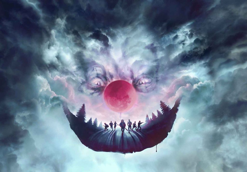
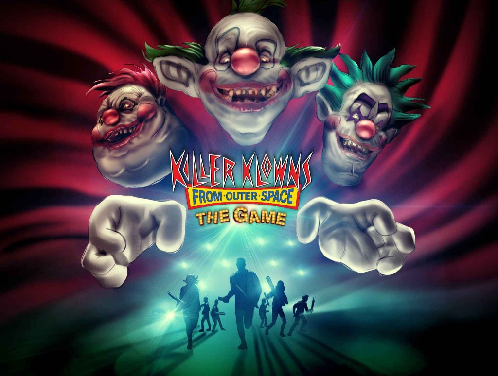
A finished illustration establishes the lighting, palette, and overall atmosphere while serving as a blueprint for the 3D artists and production team. For this concept, oversized clown hands became the visual hook that immediately communicated the franchise. - The final artwork combines illustration with 3D production.
Using the in-game character models, we refined lighting, rendering, and paint-over techniques to create an image that felt cinematic, handcrafted, and true to the spirit of the original film.
01. EARLY CONCEPT EXPLORATION
02. CONCEPT TO COLOR ILLUSTRATION
03. FINAL KEY ART
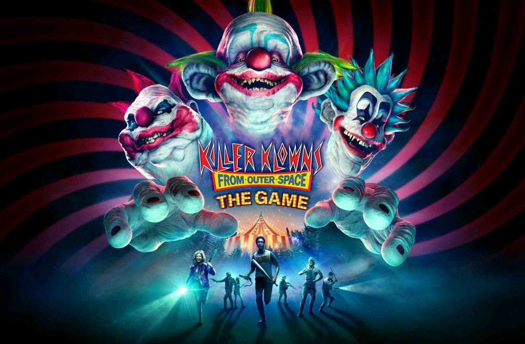
The final composition needs to work everywhere, from digital storefronts and social media to retail packaging and promotional materials. This swirling background became a great way to extend out the brand’s visual identity.
Launching New Stories in the Wizarding World
Keeping players engaged in a live game means every major update has to feel like a new chapter in the story, not just a list of features.
Across multiple launch campaigns for Harry Potter: Hogwarts Mystery, I developed story concepts, creative directed trailers, and built narrative frameworks that introduced new gameplay while staying true to the emotional language of the Wizarding World.
THE CHALLENGE
Quidditch wasn’t simply a new feature, it was one of the biggest updates since the game’s launch, and it had to be BIG.
The campaign needed to introduce an entirely new gameplay system while making players feel like they were finally receiving their Hogwarts acceptance letter all over again.
THE IDEA
Instead of leading with gameplay, we treated the trailer like a short Harry Potter animated film.
Every scene builds anticipation before revealing the Quidditch pitch, allowing the audience to experience discovery alongside the player, a new character we designed for the campaign.
The goal was to make players remember why they fell in love with the Wizarding World in the first place.
MY ROLE
THE CHALLENGE
Each year, millions of Harry Potter fans celebrate Back to Hogwarts.
We wanted the campaign to feel like more than a seasonal event.
It needed to remind players why Hogwarts still feels like home.
At the same time, the trailer had to introduce new gameplay systems without feeling like an advertisement or a money grab.
STORYBOARD & COLOR
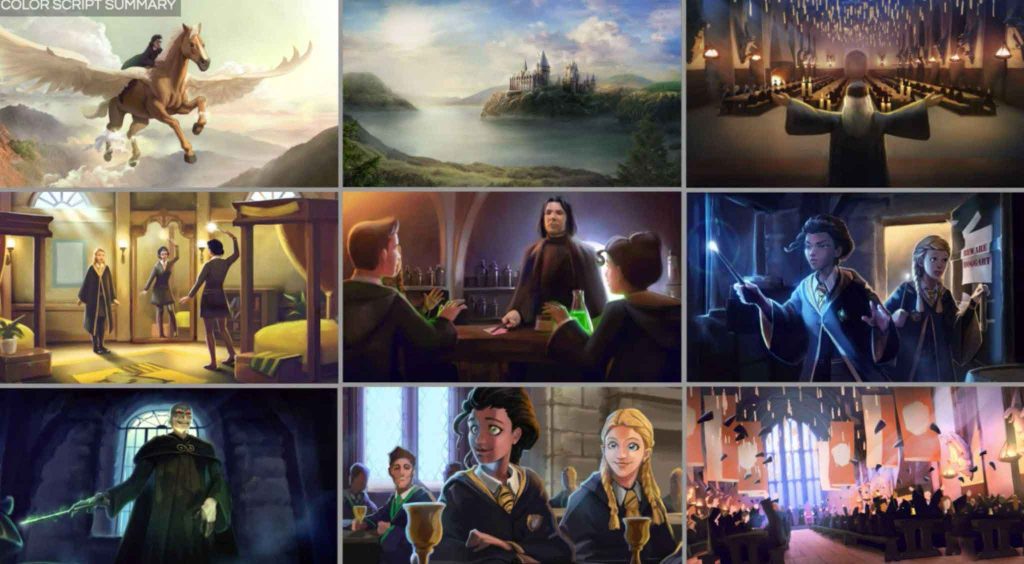
Every scene was planned around the feeling of returning to Hogwarts. Iconic movie moments, new gameplay, and emotional beats were woven together so each reveal felt like a natural part of the journey, while reminding them of why they love the Wizarding World.
THE IDEA
Instead of leading with gameplay, we treated the trailer like a short Harry Rather than showcasing features one after another, we built the trailer around the emotional journey of returning to Hogwarts.
The story was structured around iconic moments every fan remembers, from arriving at the castle to discovering new classrooms, professors, friendships, and magical surprises.
Every gameplay reveal reinforced the journey back to Hogwarts.
MY ROLE
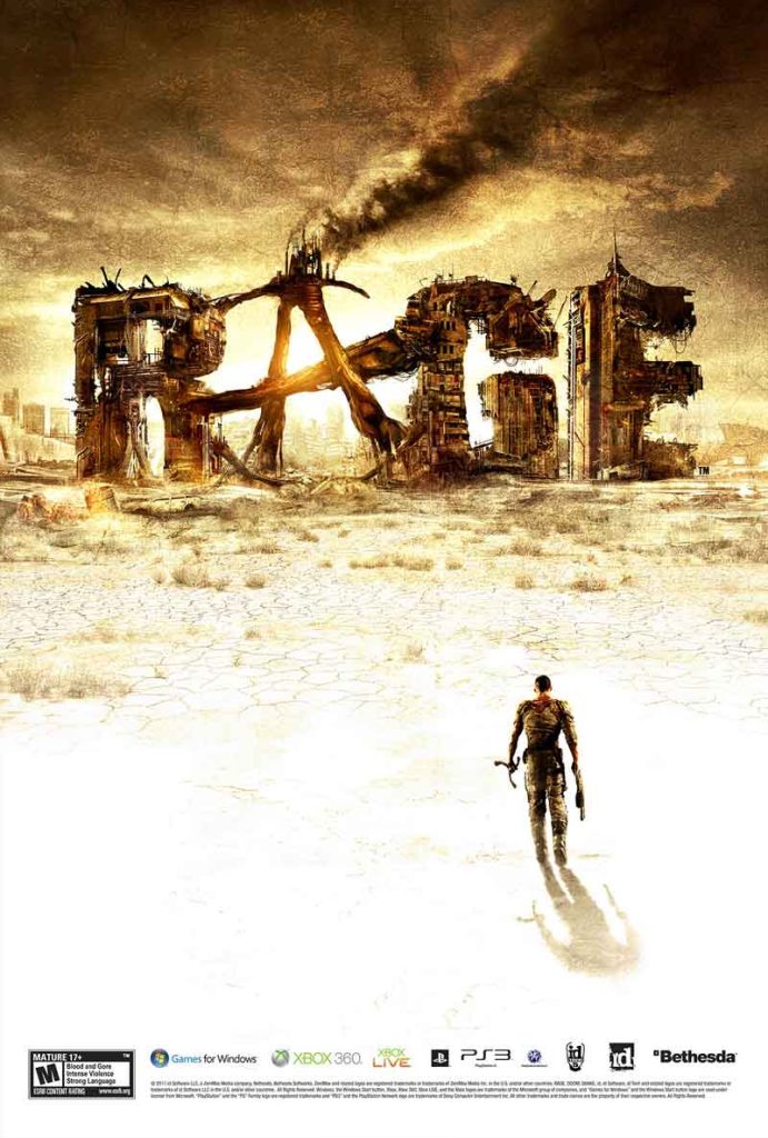
Creating the Face of an Invisible Hero
THE CHALLENGE
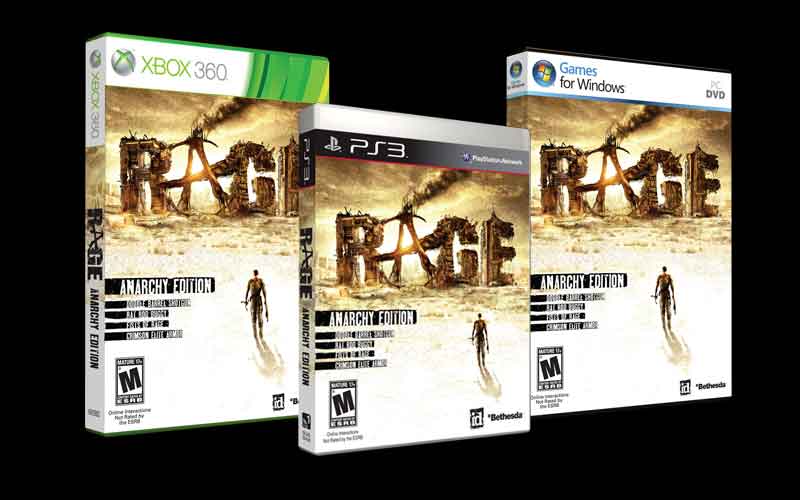
RAGE asked players to step into an entirely new universe.
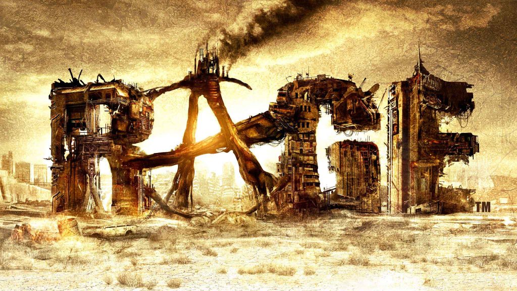
Unlike established franchises, there were no recognizable characters or decades of fan expectations to build on. We had to create a visual identity that made people curious before they knew anything about the game.
MY ROLE
EXPANDING THE WORLD
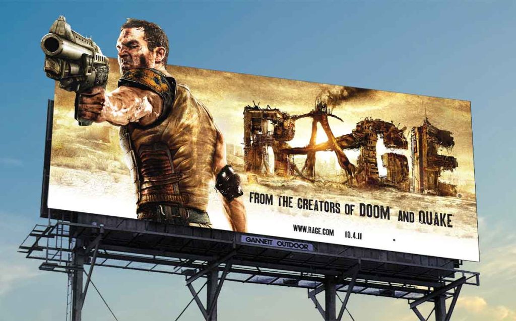
Every billboard, package, and advertisement needed to communicate the same world before a player had seen a single second of gameplay.
CHARACTER DESIGN
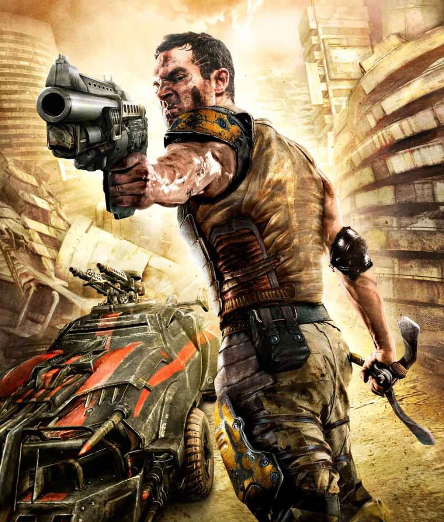
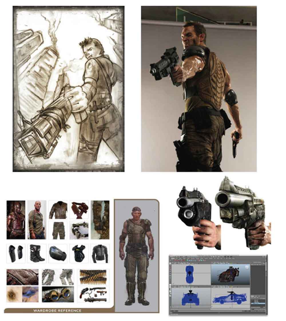
One unusual challenge was creating the marketing hero for a game where the protagonist is never seen.
Working directly with Bethesda and id Software, we designed a character built specifically for the campaign. We used in-game weapons, armor, and world-building details to create someone who felt authentic to the universe while giving audiences a memorable face to follow.
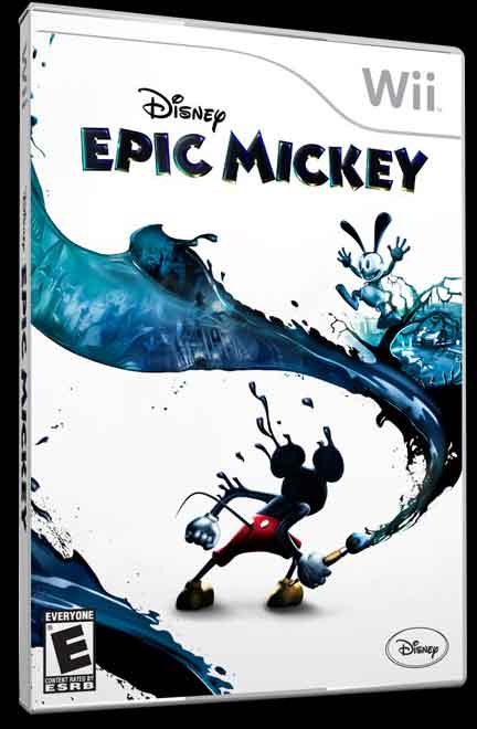
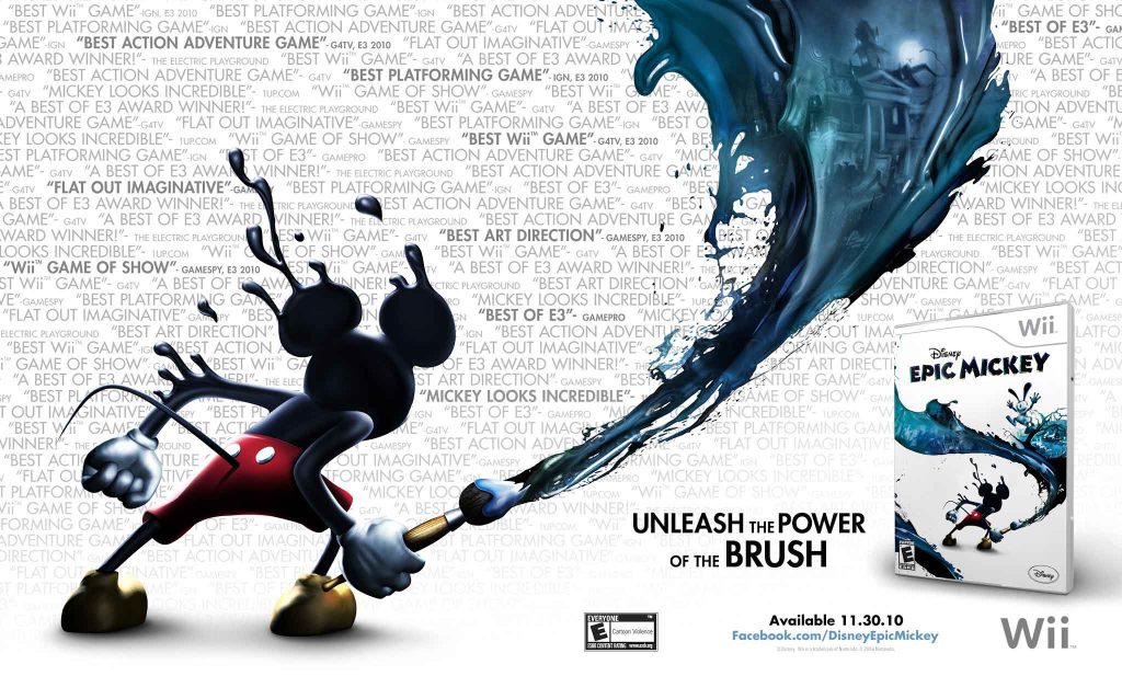
Reimagining Mickey Mouse
THE CHALLENGE
Few characters are more recognizable than Mickey Mouse.
The challenge wasn’t making him look different.
It was making him feel new and exciting while still feeling unmistakably Disney.
MY ROLE
THE IDEA
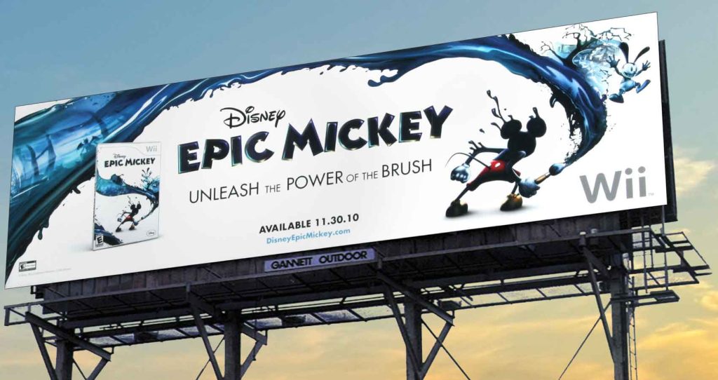
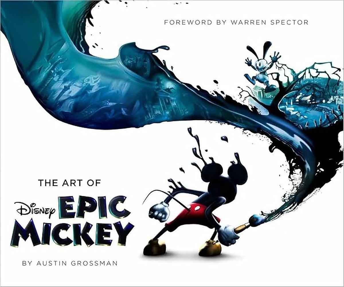
Warren Spector’s vision introduced a darker, more adventurous version of Mickey. Our campaign embraced that shift while keeping the brush itself at the center of every visual.
It wasn’t just a weapon.
It became the symbol of the entire game, and something gamers wanted to try for themselves.
AWARDS
The campaign received three Game Marketing Awards, including Best Print Campaign, Best Family Marketing Campaign, and Best Outdoor Advertising.